Two dashboards can use the same fundraising data and tell different stories. The difference is often not the chart type, the color palette, or the software. It is the reporting grain.
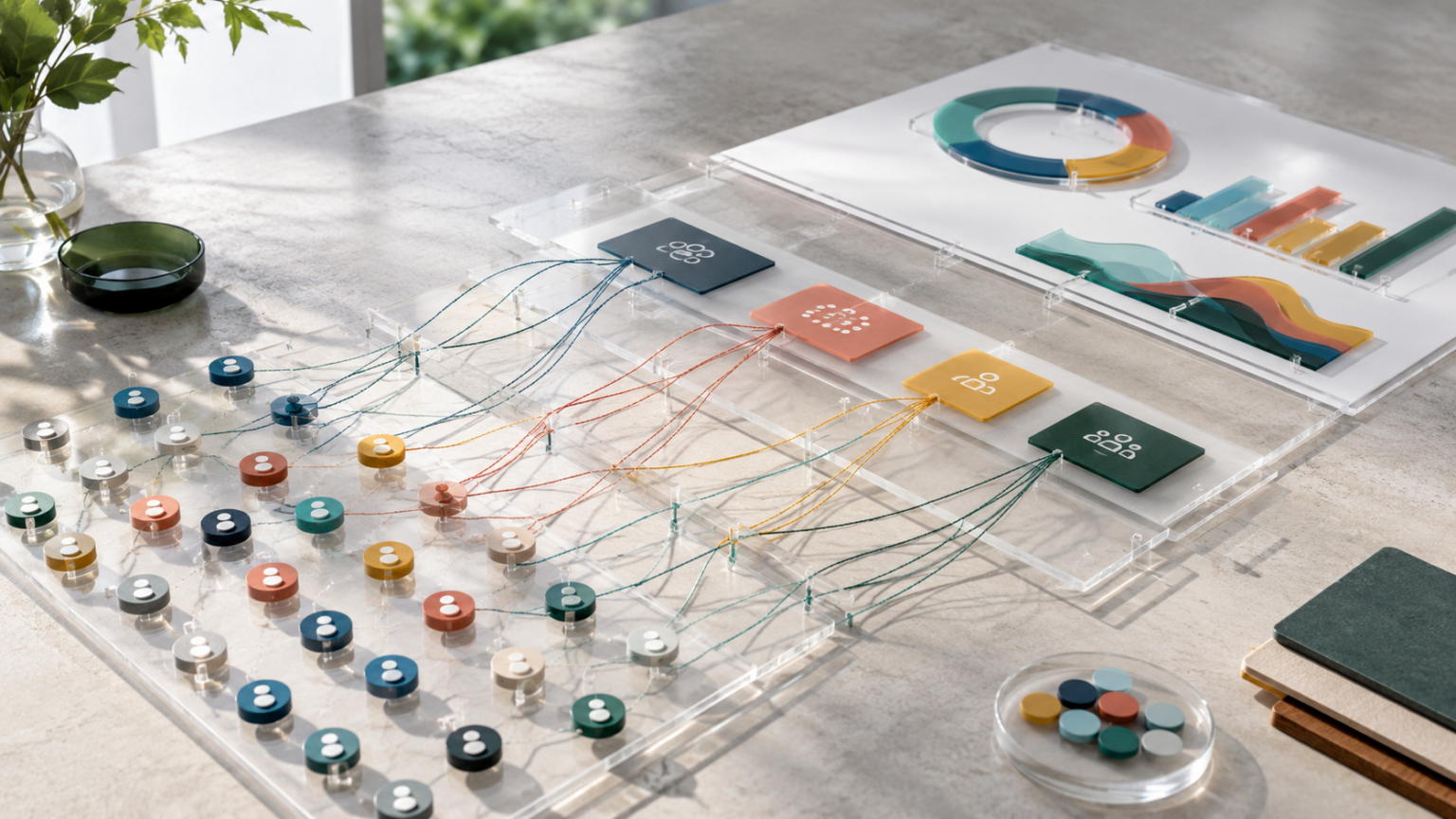
Reporting grain means the level of detail each row or record represents before the data is grouped into a report. A gift-level report, a donor-level report, a household-level report, a campaign-level report, and a month-level report can all be true. They just answer different questions.
That matters more in 2026 because the sector is getting mixed signals. Giving USA 2026 reported that U.S. charitable giving reached an estimated $617.20 billion in 2025, up 5.7% in current dollars and 3.0% after inflation. At the same time, the Fundraising Effectiveness Project reported 2025 revenue growth alongside a 3.6% decline in donor counts. M+R Benchmarks 2026 found online revenue up 15%, with 37% of online revenue arriving in December.
Those numbers are useful context. But for your organization, the real decision is not whether the sector is up or down. It is whether your reports are detailed enough to show which donors, channels, campaigns, and time windows are creating sustainable value.
What is reporting grain?
Reporting grain is the smallest unit of detail your report is built from.
If the grain is one row per gift, the report can answer gift-level questions: What was the amount? Which campaign code was attached? Was the gift one-time, recurring, DAF, pledge payment, or event-related? Did it arrive online or offline?
If the grain is one row per donor, the report can answer donor-level questions: Is this person new, retained, reactivated, upgraded, downgraded, or lapsed? What is their cumulative giving? Which touchpoints happened before and after the gift?
If the grain is one row per campaign, the report can answer campaign-level questions: How much did the campaign raise? What did it cost? How did it perform against goal? Which channels contributed?
None of those grains is automatically better. The wrong grain is the one that hides the decision you need to make.
Why fundraising dashboards go wrong when the grain is too coarse
A board dashboard usually needs rollups. Leaders do not need to inspect every donation record during a meeting.
But if the underlying grain is too coarse, the dashboard loses the ability to explain itself. A campaign total might look strong because a few major gifts landed late. A donor acquisition report might look efficient because it counts first gifts but ignores whether those donors gave again. A December revenue chart might look healthy while the rest of the year shows weak engagement.
This is where reporting grain becomes a practical safeguard. The dashboard can show the summary, but the team should be able to drill back to the detail that produced it.
For example, a campaign revenue total should be backed by gift-level records, donor-level status, channel-level source data, and date-level timing. If those pieces are flattened too early, you can see the number but not the reason.
The common reporting grains nonprofit teams actually use
Most fundraising reports use one or more of these grains:
- Gift grain: one row per transaction, useful for revenue, restrictions, payment method, fees, and campaign coding.
- Donor grain: one row per donor, useful for retention, lifetime value, segment movement, and stewardship coverage.
- Household or account grain: one row per household, organization, or account, useful for major gifts, corporate giving, and relationship management.
- Touchpoint grain: one row per email click, event attendance, call, meeting, mailing, form start, or other engagement action.
- Campaign grain: one row per appeal, campaign, event, or source code, useful for performance comparisons and executive reporting.
- Time grain: one row per day, week, month, quarter, or year, useful for pacing, forecasting, seasonality, and board trendlines.
The better question is not, “Which grain should we use?” It is, “Which grain matches this decision?”
How to choose the right grain for a fundraising question
Start with the decision, then pick the grain.
If you need to know whether a campaign raised enough money, campaign grain may be enough. If you need to know whether the campaign created future donor value, campaign grain is not enough. You need donor grain and gift grain, plus a time window for second gifts or recurring conversion.
If you need to know whether your December giving spike was healthy, month-level reporting is a start. But M+R’s finding that 37% of online revenue arrived in December is a reminder that timing can concentrate results. You still need gift grain and donor grain to separate one-time year-end response from new monthly commitments, retained donors, DAF grants, and unusually large gifts.
If you need to know whether donor counts are shrinking while revenue rises, donor grain is the center of the report. FEP’s 2025 pattern, higher dollars with fewer donors, is exactly the kind of sector signal that can look fine in a revenue-only dashboard and concerning in a donor-file report.
A simple reporting grain checklist
Before building or approving a fundraising dashboard, ask five questions:
- What does one row represent? A gift, donor, household, touchpoint, campaign, channel, or time period?
- What gets lost when the report rolls up? Donor status, source quality, gift restrictions, payment fees, engagement timing, or attribution confidence?
- Can we drill down from the summary? A board chart should not require clutter, but the underlying detail should still be available.
- Are we mixing grains in one metric? For example, do not divide campaign-level revenue by donor-level counts unless the rules are clear.
- Does the grain match the action? If the next step is donor follow-up, the report probably needs donor or touchpoint grain. If the next step is budget allocation, it may need channel, campaign, and cost grain.
Where grain problems show up in attribution reporting
Attribution reports are especially sensitive to grain.
A last-touch campaign report may credit the final email before a gift. A first-touch report may credit the original acquisition source. A multi-touch report may include several engagement records. All three can be useful, but each uses a different relationship between gifts, donors, touchpoints, and campaigns.
Trouble starts when a report claims attribution certainty without showing the grain behind it. A donor may click three emails, attend an event, receive direct mail, and give through a branded search visit. If the dashboard only stores one campaign value on the gift record, it cannot explain the donor journey. It can only preserve the one field that survived the rollup.
That does not mean every nonprofit needs a complex attribution model. It means the report should be honest about its grain. Sometimes the right label is “gift source.” Sometimes it is “assisted campaign.” Sometimes it is “donor journey signal.” Those labels prevent teams from over-reading a number.
How ReportWerks helps protect the detail behind the summary
ReportWerks is built for nonprofit teams that need both clean executive reporting and enough underlying detail to make better decisions. The goal is not to make every dashboard more complicated. It is to keep the grain clear so the summary can be trusted.
That means campaign results can be viewed alongside donor status, attribution signals, timing, channel cost, and follow-up activity. A board report can stay focused, while the fundraising team can still inspect the records behind the trend.
When the grain is explicit, reports become easier to trust. Leaders can see what a number includes, what it excludes, and what action it supports.
FAQ: reporting grain for nonprofit fundraising teams
What is reporting grain in fundraising analytics?
Reporting grain is the level of detail used to build a fundraising report, such as one row per gift, donor, campaign, touchpoint, or month. It determines what questions the report can answer.
Why does data granularity matter in fundraising dashboards?
Data granularity matters because high-level totals can hide donor behavior, attribution gaps, cost differences, and timing patterns. A dashboard can be simple on the surface while still preserving detailed records underneath.
How do nonprofits avoid mixing reporting grains?
Define what each metric counts before building the report. Then document whether the metric uses gift-level, donor-level, campaign-level, channel-level, or time-based records.
Should board reports use detailed fundraising data?
Board reports should usually show summaries, not raw records. But those summaries should be built from well-defined detail so staff can explain changes, risks, and recommended actions when questions come up.
Next step: Pick one important dashboard metric this week and write down its grain. If the team cannot say what one row represents before it becomes a chart, the metric probably needs a cleaner definition.